Create
Create Custom Field
POST - /v2/companies/<company_id>/custom-fields
Required Properties
Property | Data Type | Description |
|---|---|---|
name | String | The name of the Custom Field that will appear in the UI and dictate what the integration property name for the field becomes. |
type | String | The type of Custom Field this will be. The type cannot be changed once a field is created. Valid options are: Type details are explained below. |
Optional Properties
Property | Data Type | Description |
|---|---|---|
can_filter | Boolean | If set to |
integration_only | Boolean | If set to |
on_projects | Boolean | Controls whether this field is available to Projects. Default: |
on_people | Boolean | Controls whether this field is available to People. Default: |
description | String | A description of what this field is used for. Helpful for Admin users understanding impacts of the field when in settings. |
values | Array of Strings | Only available to type: |
sort_by | String | Only available to type: Valid options are: If you select Default: |
Custom Field Types
To understand the different field types you can create, read through the below breakdown.
Text
The text field will create a single line input in the UI that accepts any String value.

Number
The number field will create a single line input in the UI that accepts any numeric value.

Currency
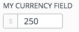
The currency field will create a single line input that accepts any numeric value and is visually distinct in the UI from the standard number field.
Hex-Color
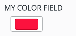
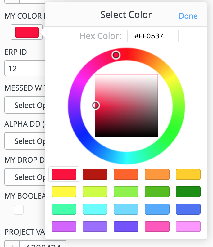
The hex-color field accepts hex values as Strings with the format #53A9FF. This field has a UI component that presents users with a color picker for editing the field. The color field cannot be used as a filter.
Bool
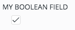
The bool field creates a checkbox in the UI that accepts a Boolean value.
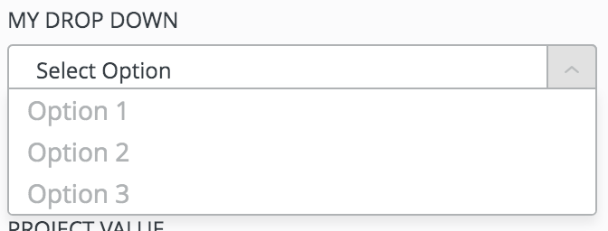
Select
The select field provides a drop-down in the UI that is populated with the values you set as options for the field. From the API, this field accepts a String representing one of your option values.
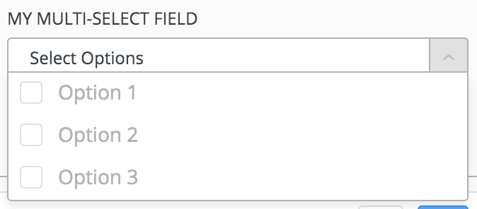
Multi-Select
The multi-select field provides a drop-down where multiple options can be selected. This field takes in an Array of Strings that represent values from the field's options.
Date
The date field presents a date selector in this UI.
This field can accept values in the following formats:
- ISO: Mon Nov 04 2019 12:12:36 GMT-0600 (Central Standard Time)
- Epoch MS Timestamp: 1572891249184
- Date String: "11/4/19"
Dates for this field will be returned in requests as a date string "11/4/19".

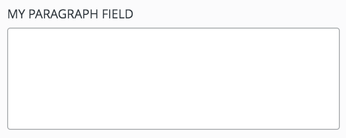
Paragraph
The paragraph field will present a multi-line text area in the UI. This field does not have a character limit on it and it may not be used as a filter.
Full POST Body Ex.
{
  "name": "Location",
  "type": "select",
  "can_filter": true,
  "integration_only": false,
  "on_projects": true,
  "on_people": true,
  "description": "This field helps us filter down to different offices within our region groups",
   // Only need the below due to it being a type: "select".
  "values": ["Chicago", "Iowa", "Kansas City"],
  "sort_by": "alpha"
}
Responses:
Successful Response
When a new Custom Field has been successfully added to your LaborChart account, you will be returned the UUID representing the new Custom Field as confirmation.
{"id": "3f447732-33ec-4b8e-a5d0-6462c12e18e6"}Updated 12 months ago
